I have seen several visualizations of COVID-19 data on social media and wanted to create them in Python to have the charts updated every day, and also to practice using plotly for interactive visualization.
The data available mainly covers the number of infected and deceased people; I also want to visualize data on recovered people and active cases.
You can interact with the charts using the mouse, and the charts will update daily with new data!
Data extracted from the 2019 Novel Coronavirus COVID-19 (2019-nCoV) Data Repository by Johns Hopkins CSSE
https://github.com/CSSEGISandData/COVID-19
Updates Made (Click)
- 25/May/2020 add recovered people data
- 29/May/2020 update to plotly 0.48
- 25/Sep/2020 World map of confirmed cases by country with choropleth
- 24/Nov/2022 Top 10 country progression
- 21/Oct/2023 update charts and libraries

1. Python Packages and Data
Python Packages
!pip install chart_studio -q
import pandas as pd
import plotly.express as px
import numpy as np
import chart_studio
To upload interactive plotly charts to chart studio
#chart-studio api
username = '' # your username
api_key = '' # your api api_key
chart_studio.tools.set_credentials_file(username=username, api_key=api_key)
import chart_studio.plotly as py
#print pandas, px an numpy version
print('pandas version: ', pd.__version__)
print('numpy version: ', np.__version__)
pandas version:  2.1.1
numpy version:  1.26.0
Import Data
confirmed = pd.read_csv('https://github.com/CSSEGISandData/COVID-19/raw/master/csse_covid_19_data/csse_covid_19_time_series/time_series_covid19_confirmed_global.csv')
death = pd.read_csv('https://github.com/CSSEGISandData/COVID-19/raw/master/csse_covid_19_data/csse_covid_19_time_series/time_series_covid19_deaths_global.csv')
recovered = pd.read_csv('https://github.com/CSSEGISandData/COVID-19/raw/master/csse_covid_19_data/csse_covid_19_time_series/time_series_covid19_recovered_global.csv')
CSSEGISandData/COVID-19 Data
Data description in English
Province/State: China - province name; US/Canada/Australia/ - city name, state/province name; Others - name of the event (e.g., “Diamond Princess” cruise ship); other countries - blank.
Country/Region: country/region name conforming to WHO (will be updated).
Last Update: MM/DD/YYYY HH:mm (24 hour format, in UTC).
Confirmed: the number of confirmed cases. For Hubei Province: from Feb 13 (GMT +8), we report both clinically diagnosed and lab-confirmed cases. For lab-confirmed cases only (Before Feb 17), please refer to who_covid_19_situation_reports. For Italy, diagnosis standard might be changed since Feb 27 to “slow the growth of new case numbers.”
Deaths: the number of deaths.
Recovered: the number of recovered cases.
confirmed.iloc[:5,:8]
| Province/State | Country/Region | Lat | Long | 1/22/20 | 1/23/20 | 1/24/20 | 1/25/20 | |
|---|---|---|---|---|---|---|---|---|
| 0 | NaN | Afghanistan | 33.93911 | 67.709953 | 0 | 0 | 0 | 0 |
| 1 | NaN | Albania | 41.15330 | 20.168300 | 0 | 0 | 0 | 0 |
| 2 | NaN | Algeria | 28.03390 | 1.659600 | 0 | 0 | 0 | 0 |
| 3 | NaN | Andorra | 42.50630 | 1.521800 | 0 | 0 | 0 | 0 |
| 4 | NaN | Angola | -11.20270 | 17.873900 | 0 | 0 | 0 | 0 |
General DataFrame Information
confirmed.info()
<class 'pandas.core.frame.DataFrame'>
RangeIndex: 289 entries, 0 to 288
Columns: 1147 entries, Province/State to 3/9/23
dtypes: float64(2), int64(1143), object(2)
memory usage: 2.5+ MB
Countries with multiple data entries per Province/State
print(confirmed
      .loc[confirmed['Country/Region'].duplicated(keep=False),
           'Country/Region']
      .drop_duplicates()
      .unique()
    )
['Australia' 'Canada' 'China' 'Denmark' 'France' 'Netherlands'
 'New Zealand' 'United Kingdom']
Sum the data for each country
def sumar_datos_region(df: pd.DataFrame) -> pd.DataFrame:
    """
    Suma los datos de cada región en el dataframe dado.
    Args:
        df (pd.DataFrame): El dataframe del cual se sumarán los datos.
    Returns:
        pd.DataFrame: Un nuevo dataframe con los datos sumados para cada región.
    """
    df = (df.groupby(['Country/Region'])
          .sum()
          .reset_index())
    return df

# aplicar la función a los tres dataframes
confirmed, death, recovered = (sumar_datos_region(df)
                               for df
                               in (confirmed, death, recovered))
Set Country/Region as the index of the dataframes
confirmed, death, recovered = (df.set_index('Country/Region')
                               for df
                               in (confirmed, death, recovered))
Recovered Cases Data
Click to view code
total_recuperados_dia = recovered.loc[:,:'8/15/21'] .sum(axis="index")
px.line(x=total_recuperados_dia.index,
        y=total_recuperados_dia.values,
        title='Numero de casos recuperados por dia')
The Recovered data is only available up to August 4, 2021
World Data by Day
Click to view code
column_names = ["Fecha", "Confirmados", "Recuperados","Muertos"]
world = pd.DataFrame(columns = column_names)
world["Fecha"] = confirmed.columns
world["Confirmados"] = confirmed.sum(axis='rows').values
world["Recuperados"] = recovered.sum(axis='rows').values
world["Muertos"] = death.sum(axis='rows').values
world["Activos"] = world["Confirmados"] - world["Recuperados"] - world["Muertos"]
2. Covid-19 in the World
Animated Evolution of Active Cases by Country
The animated chart of the temporal evolution of active cases by country was created using the Pandas alive and Bar Chart Race libraries.
Click to view code
import pandas_alive
active_evol = active_group.set_index('date')
active_evol.index = pd.to_datetime(active_evol.index)
active_evol.plot_animated(filename='evolucion_casos_activos.mp4', n_bars=8,n_visible=8,
                          title='Evolución en el tiempo de Casos Activos COVID-19 por pais \n https://joserzapata.github.io/',
                          perpendicular_bar_func='mean', dpi=300,
                          period_label={'x': .99, 'y': .25, 'ha': 'right', 'va': 'center'},
                          period_fmt='%B %d, %Y',
                          period_summary_func=lambda v: {'x': .99, 'y': .18,
                                      's': f'Total Activos: {v.nlargest(8).sum():,.0f}',
                                      'ha': 'right', 'size': 9, 'family': 'Courier New'})
Visualization with Plotly
World Values of Confirmed, Active, Recovered, and Deceased Cases
Click to view code
fig = px.bar(world.iloc[-1][["Confirmados","Muertos"]],
             x = ["Confirmados","Muertos"], color = ["Confirmados","Muertos"],
             y = world.iloc[-1][["Confirmados","Muertos"]].values,
             text = world.iloc[-1][["Confirmados","Muertos"]].values,
             color_discrete_sequence=["navy","coral"],
             height=500, width=600,
             title='Total casos COVID-19 en el mundo al {}'.format(world.iloc[-1]['Fecha']),
             labels={'value':'Número de casos', 'variable':'Tipo de caso'})
fig.update_traces(textposition='outside')#poner los valores de las barras fuera
fig.add_annotation(x= 'Muertos', y=world["Confirmados"].max(), text='https://joserzapata.github.io/', showarrow=False)
fig.layout.update(showlegend=False,
                  yaxis =  {"title": {"text": "Numero de Personas"}}, # Cambiar texto eje y
                  xaxis =  {"title": {"text": ""}} #Esconder nombre eje x
                  )
# grabar grafica en chart-studio si se proporciona el api-key
if api_key: py.plot(fig, filename = 'total_casos_general', auto_open=False)
fig.show()
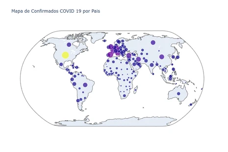
World Map of Confirmed Cases by Country
Hover the mouse over the map to see information for each country
Click to view code
conf_max = confirmed.iloc[:,-1].copy()
conf_max = conf_max.to_frame().reset_index()
conf_max = conf_max.rename(columns = {'3/9/23':'Confirmados'})

fig = px.choropleth(conf_max, locations="Country/Region", locationmode='country names',
                     color=np.log10(conf_max["Confirmados"]),hover_name="Country/Region",
                     hover_data = ["Confirmados"],
                     projection="natural earth", width=900,
                     color_continuous_scale = px.colors.sequential.Jet,
                     title='Mapa de Confirmados COVID 19 por Pais - 3/9/23')
fig.add_annotation(x=0.5, y=0,text='https://joserzapata.github.io/', showarrow=False)
fig.update(layout_coloraxis_showscale=False)
# grabar grafica en chart-studio si se proporciona el api-key
if api_key: py.plot(fig, filename = 'mapa_confirmados_pais', auto_open=False)
fig.show()
Confirmed vs Deceased by Country
Click to view code
max_fecha = "3/9/23"
death_max = death.iloc[:,-1].copy()
death_max = death_max.to_frame().reset_index()
death_max = death_max.rename(columns = {max_fecha:'Muertos'})

maxi_y = death_max["Muertos"].max()
maxi_x = conf_max["Confirmados"].max()

full_melt_max = pd.merge(conf_max[['Country/Region','Confirmados']],
                         death_max[['Country/Region','Muertos']],
                         on='Country/Region', how='left')

fig = px.scatter(full_melt_max.sort_values('Muertos', ascending=False).iloc[:15, :],
                 x='Confirmados', y='Muertos', color='Country/Region',
                 size='Confirmados', height=500,width=900,
                 text='Country/Region', log_x=True, log_y=True,
                 title= f'Muertos vs Confirmados - {max_fecha} - (15 Paises)')
fig.add_annotation(x=0.5, y=1, xref="paper",yref="paper",
                   text='https://joserzapata.github.io/', showarrow=False)
fig.update_traces(textposition='top center')
fig.layout.update(showlegend = False)

# grabar grafica en chart-studio si se proporciona el api-key
if api_key: py.plot(fig, filename = 'scatter_muertos_confirmados', auto_open=False)
fig.show()
World Progression Over Time of Confirmed and Deceased Cases
Click to view code
fecha_datos_completos = '8/4/21'
pos_final = len(world.set_index('Fecha').loc[:fecha_datos_completos,:])
world = world.iloc[:pos_final,:]
world_melt = world.melt(id_vars='Fecha',
                         value_vars= list(world.columns)[1:],
                         var_name=None)
fig = px.line(world_melt, x="Fecha", y= 'value',
              color='variable',  color_discrete_sequence=["teal","green","coral", "navy"],
              title=f'Total de Casos en el tiempo de COVID 19 - {fecha_datos_completos}')
for n in list(world.columns)[1:]:
  fig.add_annotation(x=world.iloc[-1,0], y=world.loc[world.index[-1],n],
                     text=n, xref="x",yref="y",
                     showarrow=True, ax=-50, ay=-20)
# Indicador de numero total de confirmados
fig.add_indicator( title= {'text':'Confirmados', 'font':{'color':'teal'}},
                  value = world['Confirmados'].iloc[-1],
                  mode = "number+delta", delta = {"reference": world['Confirmados'
                  ].iloc[-2], 'relative': True },domain = {'x': [0, 0.25], 'y': [0.15, .4]})
#Indicador numero total de Activos
fig.add_indicator(title={'text':'Activos', 'font':{'color':'navy'}},
                  value = world['Activos'].iloc[-1],
                  mode = "number+delta", delta = {"reference": world['Activos'
                  ].iloc[-2], 'relative': True },domain = {'x': [0, 0.25], 'y': [0.6, .85]})
#Indicador numero total de Recuperados
fig.add_indicator(title={'text':'Recuperados', 'font':{'color':'green'}},
                  value = world['Recuperados'].iloc[-1],
                  mode = "number+delta", delta = {"reference": world['Recuperados'
                  ].iloc[-2], 'relative': True },domain = {'x': [0.25, 0.50], 'y': [0.6, .85]})
#Indicador numero total de muertos
fig.add_indicator(title={'text':'Muertos', 'font':{'color':'coral'}},
                  value = world['Muertos'].iloc[-1],
                  mode = "number+delta", delta = {"reference": world['Muertos'
                  ].iloc[-2], 'relative': True },domain = {'x': [0.25, 0.5], 'y': [0.15, .4]})
fig.add_annotation(x=400, y=world_melt['value'].max(),
                   text='https://joserzapata.github.io/', showarrow=False)
fig.layout.update(showlegend = False,
                  yaxis =  {"title": {"text": "Numero de Personas"}}, # Cambiar texto eje y
                  )
# grabar grafica en chart-studio si se proporciona el api-key
if api_key: py.plot(fig, filename = 'total_casos_serie', auto_open=False)
fig.show()
Total Confirmed COVID-19 Cases by Country (Top 10)
Click to view code
df1 = confirmed.copy()
fecha = confirmed.columns[-1] #obtener la fecha del ultimo dato
paises = df1.iloc[:,-1].copy() #obtener la serie sin el primer dato, fecha
paises.sort_values(ascending=False, inplace=True)
top = 10
#keep top countries
df1 = df1.loc[paises[:top].index.to_list(),:]
df1 = df1.T

if api_key:
    # se toman la serie de tiempo cada 7 dias, por que las graficas
    # grandes no se pueden subir a chart-studio con subscripcion gratuita
    df1 = df1.iloc[::-7].iloc[::-1]

fig = px.line(df1, x=df1.index, y=df1.columns, color='Country/Region',
              color_discrete_sequence=px.colors.qualitative.G10, width=900,
              hover_name='Country/Region',
              title=f'Total Casos Confirmados de COVID 19 por Pais (Top 10) - {world.iloc[-1,0]}')
# top paises mas infectados

mas_infectados=[]
for n in range(top):
  fig.add_annotation(x=fecha, y=paises.iloc[n], text=paises.index[n],
                     showarrow=True, ax=+45, xref="x",yref="y")
  mas_infectados.append(paises.index[n])

fig.layout.update(showlegend=False,
                  yaxis =  {"title": {"text": "Numero de Personas"}}, # Cambiar texto eje y
                  xaxis =  {"title": {"text": "Fecha"}} #Esconder nombre eje x
                  )
fig.add_annotation(x=200, y=df1.max().max(),
                   text='https://joserzapata.github.io/', showarrow=False)
# grabar grafica en chart-studio si se proporciona el api-key
if api_key: py.plot(fig, filename = 'total_casos_no_china', auto_open=False)
fig.show()
Animated Map of the Temporal Evolution of COVID-19
Hover the mouse over the map to see information for each country. Press the play button to see the animation.
Click to view code
# confirmed data frame en formato wide
confirmed = confirmed.T
confirmed.reset_index(inplace=True)
confirmed.rename(columns={'index':'Fecha'}, inplace=True)
confirmed_melt = confirmed.melt(id_vars="Fecha").copy()
confirmed_melt.rename(columns = {'value':'Confirmados'}, inplace = True)

if api_key:
    # se toman la serie de tiempo cada 18 dias, por que las graficas
    # grandes no se pueden subir a chart-studio con subscripcion gratuita
    confirmed_melt = confirmed.iloc[::-30].iloc[::-1].melt(id_vars="Fecha").copy()
    confirmed_melt.rename(columns = {'value':'Confirmados'}, inplace = True)

confirmed_melt['Fecha'] = pd.to_datetime(confirmed_melt['Fecha'], format='%m/%d/%y')
confirmed_melt['size'] = confirmed_melt['Confirmados'].pow(0.3)
confirmed_melt.dropna(inplace=True) #eliminar filas con valores faltantes

fig = px.scatter_geo(confirmed_melt, locations="Country/Region", locationmode='country names',
                     color="Confirmados", size='size', hover_name="Country/Region",
                     range_color= [0, max(confirmed_melt['Confirmados'])+2],
                     projection="natural earth", animation_frame="Fecha",
                     title='Contagiados COVID 19 en el Tiempo')
fig.update(layout_coloraxis_showscale=False)
fig.add_annotation(x=0.5, y=-0.1,text='https://joserzapata.github.io/', showarrow=False)
# grabar grafica en chart-studio si se proporciona el api-key
if api_key: py.plot(fig, filename = 'mapa_evolucion_temporal', auto_open=False)
fig.show()
3. Covid-19 in Colombia
Number of COVID-19 Cases in Colombia (Through August 4, 2021)
Click to view code
column_names = ["Fecha", "Confirmados", "Recuperados","Muertos"]
colombia = pd.DataFrame(columns = column_names)
colombia["Fecha"] = confirmed["Fecha"].values
colombia["Confirmados"] = confirmed["Colombia"].values
colombia["Recuperados"] = recovered.loc["Colombia"].values
colombia["Muertos"] = death.loc["Colombia"].values
colombia["Activos"] = colombia["Confirmados"] - colombia["Recuperados"] - colombia["Muertos"]

fecha_datos_completos = '8/4/21'
pos_final = len(colombia.set_index('Fecha').loc[:fecha_datos_completos,:])
colombia = colombia.iloc[:pos_final,:]


df_melt3 = colombia.melt(id_vars='Fecha', value_vars= list(colombia.columns)[1:], var_name=None)
fig = px.line(df_melt3, x='Fecha' , y='value', color='variable',
              color_discrete_sequence=["teal","green","coral", "navy"],
              title=f'Corona virus (COVID 19) en Colombia - {colombia.iloc[-1,0]}')
# Indicador de numero total de confirmados
fig.add_indicator( title= {'text':'Confirmados', 'font':{'color':'teal'}},
                  value = colombia['Confirmados'].iloc[-1],
                  mode = "number+delta", delta = {"reference": colombia['Confirmados'
                  ].iloc[-2], 'relative': True },domain = {'x': [0, 0.25], 'y': [0.15, .4]})
#Indicador numero total de Activos
fig.add_indicator(title={'text':'Activos', 'font':{'color':'navy'}},
                  value = colombia['Activos'].iloc[-1],
                  mode = "number+delta", delta = {"reference": colombia['Activos'
                  ].iloc[-2], 'relative': True },domain = {'x': [0, 0.25], 'y': [0.6, .85]})
#Indicador numero total de Recuperados
fig.add_indicator(title={'text':'Recuperados', 'font':{'color':'green'}},
                  value = colombia['Recuperados'].iloc[-1],
                  mode = "number+delta", delta = {"reference": colombia['Recuperados'
                  ].iloc[-2], 'relative': True },domain = {'x': [0.25, 0.50], 'y': [0.6, .85]})
#Indicador numero total de muertos
fig.add_indicator(title={'text':'Muertos', 'font':{'color':'coral'}},
                  value = colombia['Muertos'].iloc[-1],
                  mode = "number+delta", delta = {"reference": colombia['Muertos'
                  ].iloc[-2], 'relative': True },domain = {'x': [0.25, 0.5], 'y': [0.15, .4]})
fig.add_annotation(x=140, y=df_melt3['value'].max(),
                   text='https://joserzapata.github.io/', showarrow=False)
fig.layout.update(showlegend=False,
                  yaxis =  {"title": {"text": "Numero de Personas"}}, # Cambiar texto eje y
                  xaxis =  {"title": {"text": "Fecha"}})
# grabar grafica en chart-studio si se proporciona el api-key
if api_key: py.plot(fig, filename = 'Colombia_general', auto_open=False)
fig.show()
Chart Updates
The charts created with plotly were uploaded to chart-studio and embedded in the web page using the HTML iframe tag. Previously, the charts were updated every 24 hours using Github Actions, but since the data source stopped being updated, it is no longer necessary to update the charts.
Jupyter Notebook Source Code
![]()
![]()
![]()
References
Data sources, visualizations, and data analysis.
- https://github.com/CSSEGISandData/COVID-19
- https://www.kaggle.com/imdevskp/covid-19-analysis-viz-prediction-comparisons
- https://junye0798.com/post/build-a-dashboard-to-track-the-spread-of-coronavirus-using-dash/
- https://github.com/Perishleaf/data-visualisation-scripts/tree/master/dash-2019-coronavirus
- https://medium.com/tomas-pueyo/coronavirus-por-qu%C3%A9-debemos-actuar-ya-93079c61e200
- https://github.com/features/actions